[MAP] epic battle (v2000)

Interesting mapping tools and mapping help.

Moderator: Morax

[MAP] epic battle (v2000)

Postby andybe » 17 Apr 2015, 01:34

well epic battle is a map that heavily rewards micromanagement of units and smart placement of defense and buildings. so those extra clicks dont feel like a hassle but actually show some reward :)

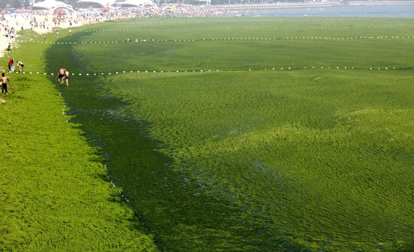
the beaches stay green i dont give shit bout your personal taste in colour

so i decided that the fact that sera and uef cruisers can shoot at the highest areas is actually just fine I watched a lot of replays and cybran destroyers often prove more effective at destroying these areas anyway. the map CAN be very turtly so cruisers can put a lot of pressure on the enemy base so games don't last for hours lol...

known bugs/imbalances:
- Sorian AI complains about missing markers.(but it still uses them so no idea whats going on atm- this seems to be merely a cosmetic problem tho)


Changelog:
Spoiler: show
v2000:
- smoothened textures
- more complexion
- terrain should now accurately reflect impassable terrain and where you may move units / build stuff
- the green stuff stays ! xD but its a lot prettier now
- mid wreckage should now be distributed more fairly / theres also some complexion around reclaimable rocks ^-^
- added ramps at the backs of front main base. now raiders can sneak along walls to backstab enemy base.

v1006:
- added missing mexes at top sea
- improved Ai markers

v1005:
- hotfix for v1004 broken scenario.lua

v1004:
- added AI markers (altho sorian Ai still complains about missing markers it actually acts upon them)o.O

v1003:
- removal of most obstacles in mid for better path finding
- textures remade

v1002:
- fixed mex at lower back position
- new textures
- fixed outer rings of high plateaus

v1001:
- fixed reclaim and mass spot clutter
- smoothened some terrain
- prettier sea
- moving some mexes from back position to the High plateaus.


TODO:
- create prettier terrain
- find a propper fix / balance for cruisers and high plateaus
- add fun events / points of interest

Image

Image

Please give feedback on bugs or imbalances, should you find any =)

and don't hesitate to make suggestions for improvements ^_^ I want this map to be a strategical challenge, so any possible strategy you can think of that you can't see workig right now let me know =)


features:

-high to low altitude combat.
-the map is tailored towards a lot of weapon ranges. (e.g. well placed T2 arties can be very impact full)
-securing the high platforms is crucial. they are easy to defend against air and cannot be touched by sea therefore they serve as excellent strategical locations.
- natural obstacles on sea and land that encourage strategical placement of units and reward micro.
- early power boost for back spot and lack of mass extractors should encourage air to engage more into early game action and securing the high plateaus instead of eco whoring
- most mexes are placed in a way that they are very vulnerable to t1 sea harassment. others are in positions where they can be easily harassed by arties from high and well secured places.
- although this is a 20 x 20 map spawn positions are "fairly" close to each other allowing for both aggressive and defensive play.
Last edited by andybe on 19 Apr 2015, 15:07, edited 21 times in total.
andybe
Crusader
 
Posts: 40
Joined: 12 Aug 2013, 02:08
Has liked: 5 times
Been liked: 0 time
FAF User Name: andybe

Re: [MAP] epic battle (v1000)

Postby TheKoopa » 17 Apr 2015, 13:38

Ok so, a couple of things

1)It doesn't look like you used any program to symmetrize and just eye-balled everything, this will definitely lead to major imbalanceness
2) The green strata is very ugly
3) Why is the green strata the beach but the sand is the main thing.......
4) It doesn't look like you balanced the mexes (again with the eyeball instead of symmetrizing, you can do this by placing props on the marker nd then rotating them 180 degrees)
5) The sea doesn't look very pretty either because of the heightmapping
Feather: I am usually pretty good in judging people's abilities, intelligence and motives

Evildrew: Just because I didnt choose you for my team last year doesnt give you the right to be all bitchy and negative about my proposal
User avatar
TheKoopa
Contributor
 
Posts: 1158
Joined: 04 Sep 2013, 18:04
Location: New York
Has liked: 172 times
Been liked: 225 times
FAF User Name: Gently-

Re: [MAP] epic battle (v1000)

Postby Col_Walter_Kurtz » 17 Apr 2015, 14:48

Nice layout could be a very good map. Hover / amphibious heavy though.
Col_Walter_Kurtz
Priest
 
Posts: 497
Joined: 28 Jul 2014, 10:42
Has liked: 42 times
Been liked: 45 times
FAF User Name: Apocalypse_Now

Re: [MAP] epic battle (v1000)

Postby andybe » 17 Apr 2015, 15:42

2 much shitstorm
Last edited by andybe on 18 Apr 2015, 03:50, edited 1 time in total.
andybe
Crusader
 
Posts: 40
Joined: 12 Aug 2013, 02:08
Has liked: 5 times
Been liked: 0 time
FAF User Name: andybe

Re: [MAP] epic battle (v1002)

Postby TheKoopa » 17 Apr 2015, 21:32

The grid is not actually perfect, it's actually off in one place.

As for mex placement you can quite clearly see they aren't symmetrical, thus leading to time imbalances.

if you put a grid over the map you will find that there is actually a lot of symmetry. using programs to make everything perfectly symmetric is just cheap and too artificial. so yeah the map is 100% hand drawn. but proximities are well balanced.


What do you mean cheap. It does 50% of the work for you and better than you can draw. Just because it's "cheap" and "artificial" doesn't mean you should miss out on this very important balance tool.

can't argue over taste.. but the green stuff is supposed to be some kind of algae not grass


Look at beaches in the real world. Is it all green? :D
Feather: I am usually pretty good in judging people's abilities, intelligence and motives

Evildrew: Just because I didnt choose you for my team last year doesnt give you the right to be all bitchy and negative about my proposal
User avatar
TheKoopa
Contributor
 
Posts: 1158
Joined: 04 Sep 2013, 18:04
Location: New York
Has liked: 172 times
Been liked: 225 times
FAF User Name: Gently-

Re: [MAP] epic battle (v1002)

Postby andybe » 18 Apr 2015, 00:09

2 much shit storm
Last edited by andybe on 18 Apr 2015, 03:51, edited 1 time in total.
andybe
Crusader
 
Posts: 40
Joined: 12 Aug 2013, 02:08
Has liked: 5 times
Been liked: 0 time
FAF User Name: andybe

Re: [MAP] epic battle (v1002)

Postby Blodir » 18 Apr 2015, 00:12

All the popular maps are symmetric apart from Phenom Spartiate (which has pretty big problems because of this), but that's not really considered common I guess. I agree with Koppa btw, symmetry is a must.
User avatar
Blodir
Contributor
 
Posts: 1175
Joined: 07 Jan 2013, 14:14
Has liked: 489 times
Been liked: 535 times
FAF User Name: Snowbound

Re: [MAP] epic battle (v1002)

Postby andybe » 18 Apr 2015, 00:16

btw some research for you sir... so you get somethign else to fap to other than porn

Spoiler: show
Image
a green coloured beach from hawai

Image
In Summer, Toxic Blue-Green Algae Blooms Plague

Image
is that... a green beach?!

Image
so am i mistaken or is that green stuff on the beach ? i wonder who put it there =D
andybe
Crusader
 
Posts: 40
Joined: 12 Aug 2013, 02:08
Has liked: 5 times
Been liked: 0 time
FAF User Name: andybe

Re: [MAP] epic battle (v1002)

Postby Blodir » 18 Apr 2015, 01:05

First one is a picture of a tourist spot (being the only green beach in the world or so) and the rest are pictures of algae. Very impressive argument.
User avatar
Blodir
Contributor
 
Posts: 1175
Joined: 07 Jan 2013, 14:14
Has liked: 489 times
Been liked: 535 times
FAF User Name: Snowbound

Re: [MAP] epic battle (v1002)

Postby TheKoopa » 18 Apr 2015, 01:14

Even if such beaches existed it still looks very ugly to do so.

Would be much better if you made where the sand is now maybe a light green of sorts and where the "algea" is now just regular sand. I can tell you now, people won't be joining because it looks very very incomplete (as well as the imbaness in symmetry).
Feather: I am usually pretty good in judging people's abilities, intelligence and motives

Evildrew: Just because I didnt choose you for my team last year doesnt give you the right to be all bitchy and negative about my proposal
User avatar
TheKoopa
Contributor
 
Posts: 1158
Joined: 04 Sep 2013, 18:04
Location: New York
Has liked: 172 times
Been liked: 225 times
FAF User Name: Gently-

Next

Return to Mapping

Who is online

Users browsing this forum: No registered users and 1 guest