Jip's WIP Mapping Thread

Interesting mapping tools and mapping help.

Moderator: Morax

Jip's WIP Mapping Thread

Postby Jip » 30 Jan 2018, 15:57

Hello everyone!

I've been in the mapping scene in the background for a while now, and I thought I'd come out for it. Hence this thread! All feedback is welcome, preferable with a clear example and a clear solution. With or without the latter, I can atleast ponder about your feedback!

A minor question about this topic - the map icons (previews) now appear double because they are also part of the attachments of this post. Can this be fixed, somehow?
Or should I host them somewhere else?


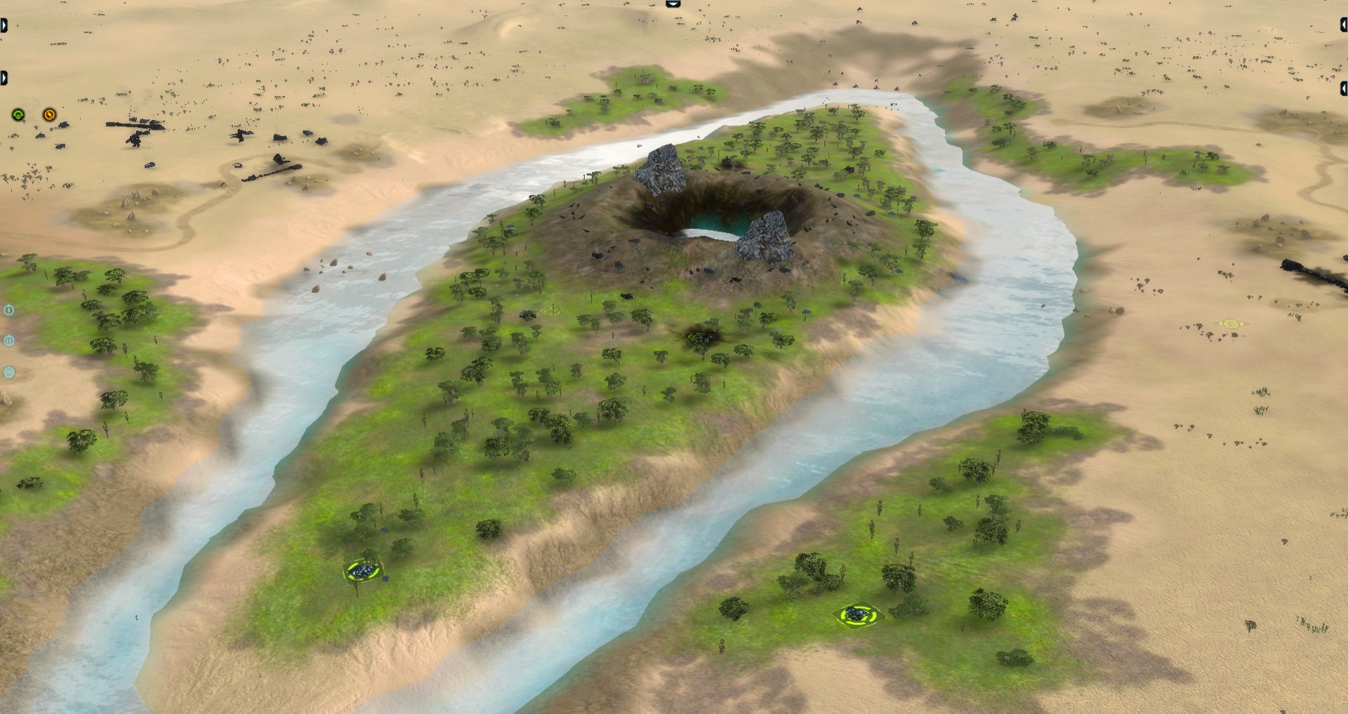
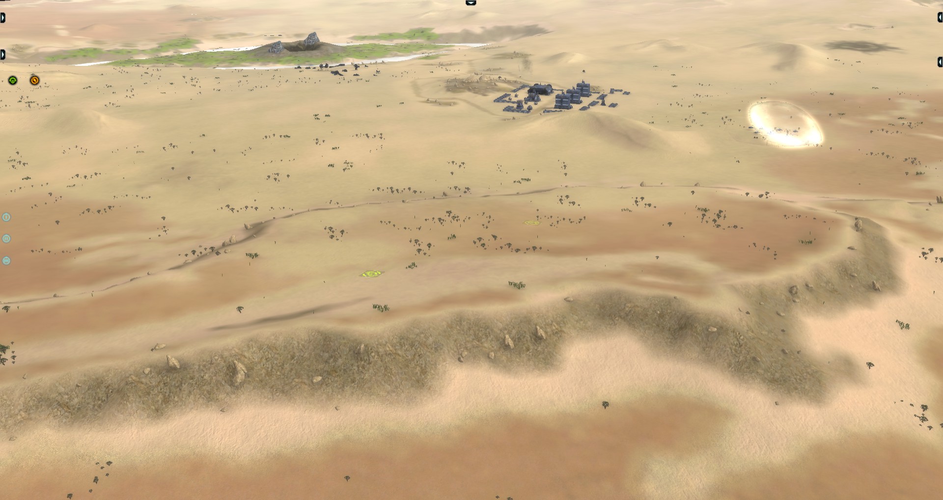
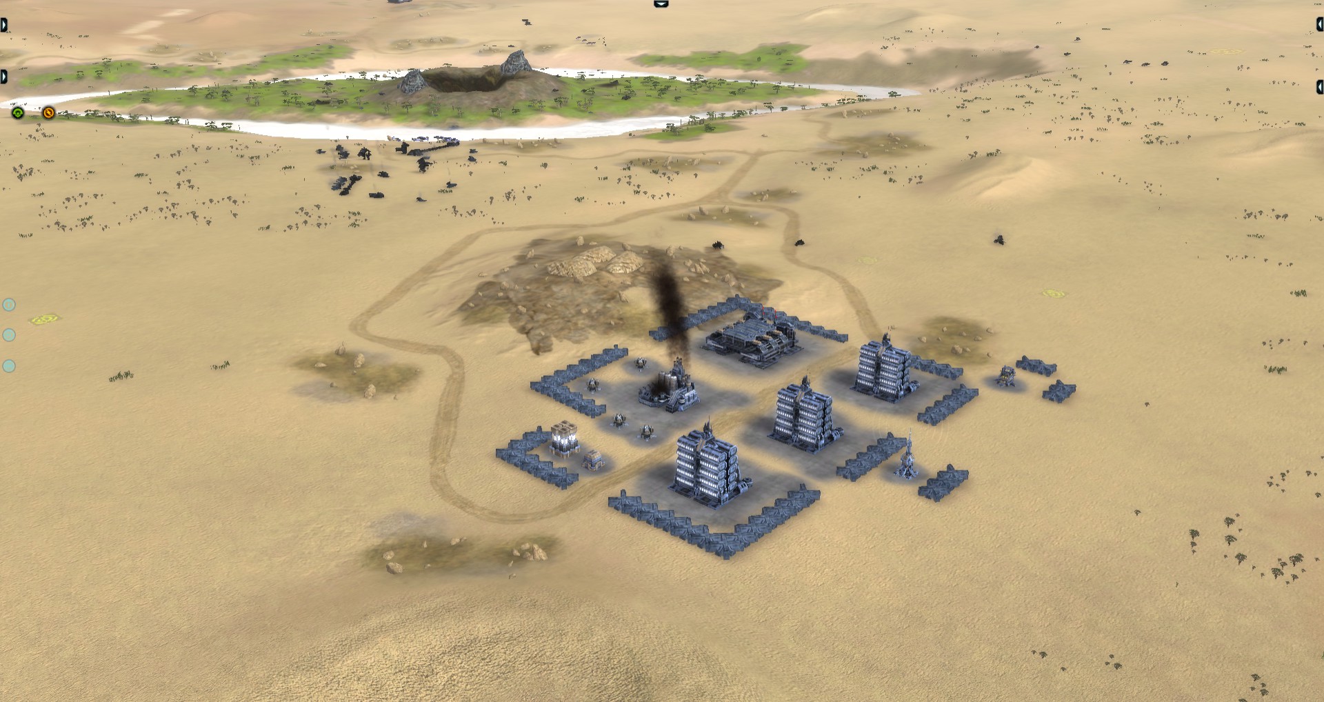
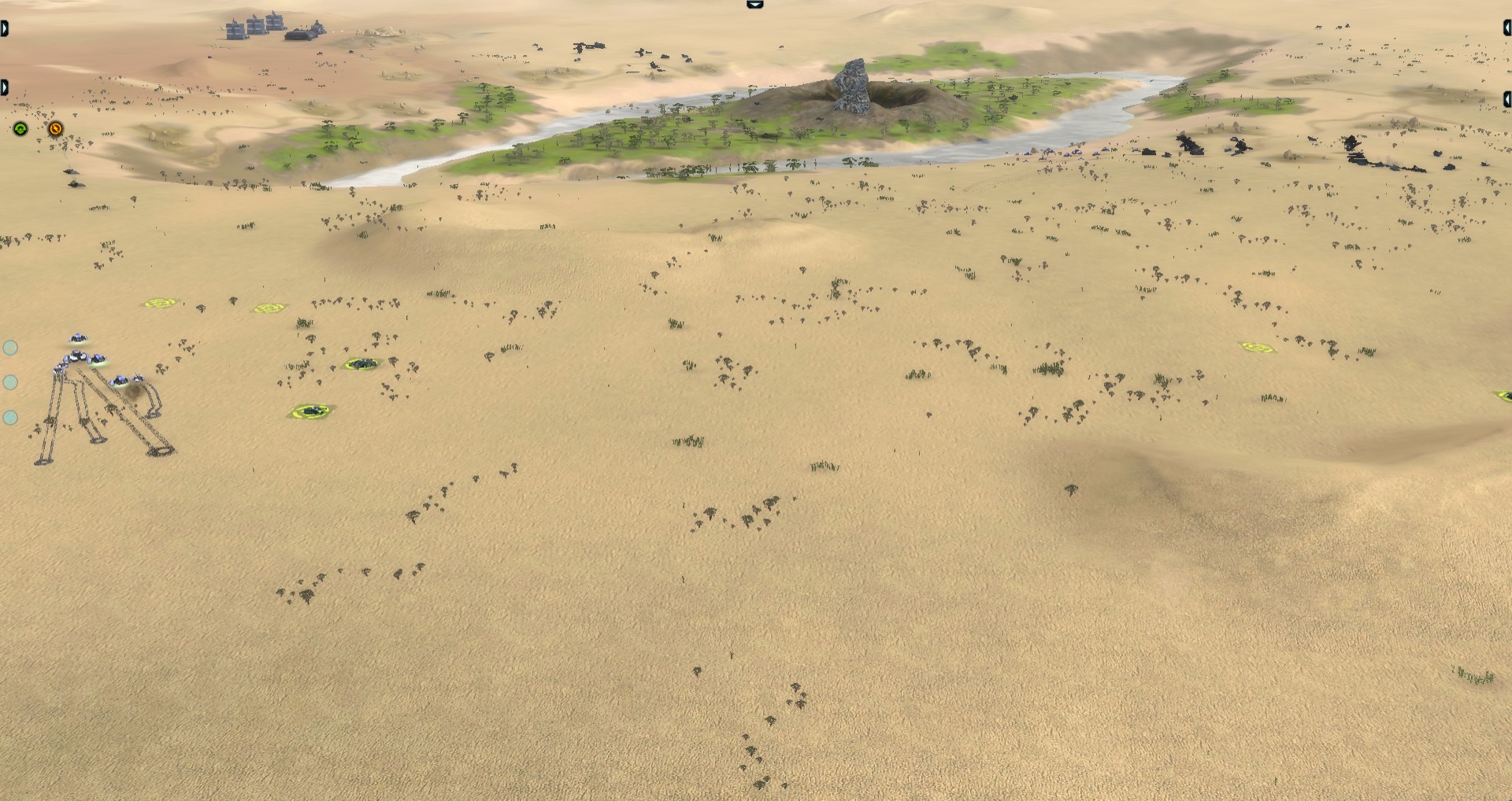
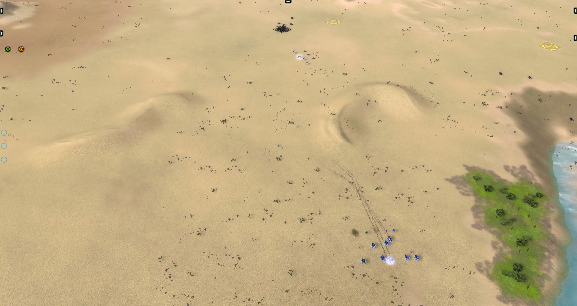
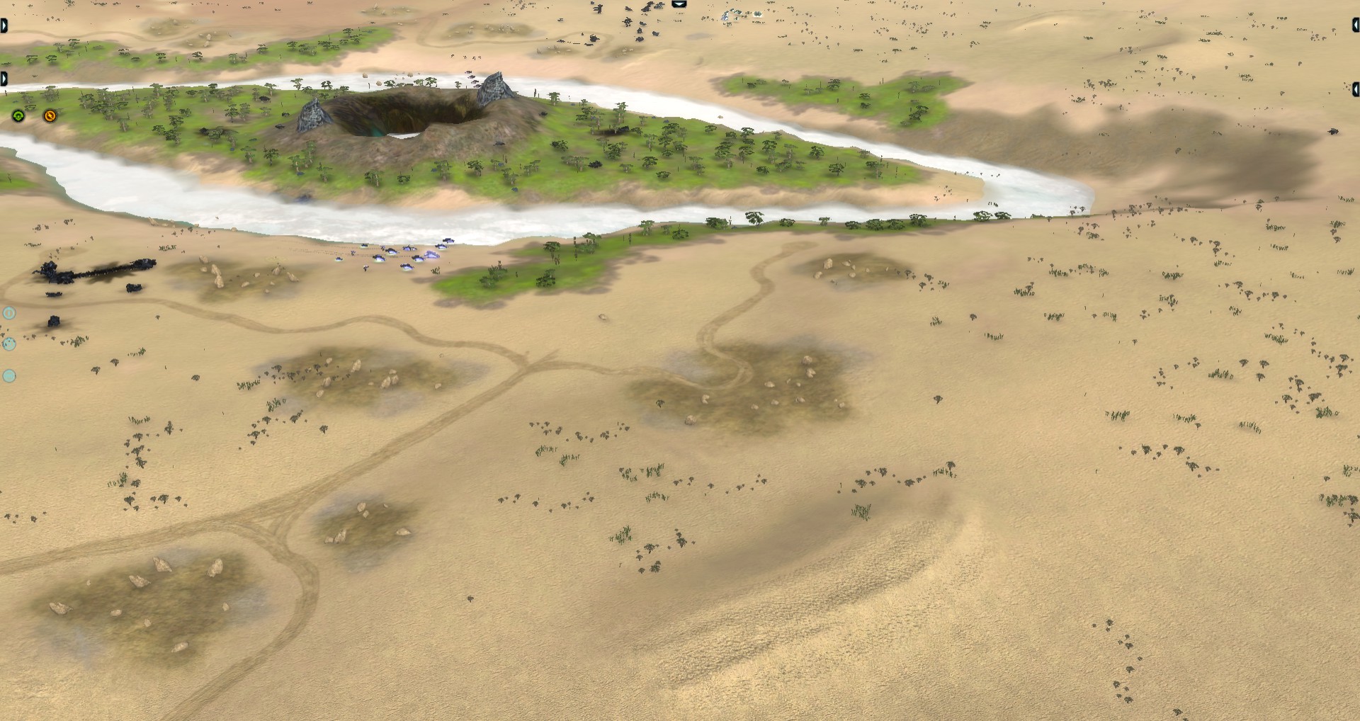
Perfidious Barrenlands (3vs3)
Once a gorgeous land, which got turned into torned wastelands. A war long forgotton, while entities still wander the lands. These treacherous lands have been found again - and is a favorite location among commanders for a stand off.

Image

Spoiler: show
Idea behind the map

Perfidious means deceitful:
- The water may appear deep, but it is not. Your commander is never fully submerged - the water is no escape!
- The terrain may appear flat, but it is not. Dunes are scattered around the barrenlands, allowing for you to hide behind it or siege with artillery from behind it!
- There are platoons walking around from previous conflicts on these fields. They are not hostile, unless provoked. If you reclaim, capture or attack them they turn hostile. Only the platoon that you provoked will turn hostile - it will turn hostile on any army that has units in a radius around the platoon. They appear on your radar - only scouting will tell whether it's a lost platoon or the enemy!

On top of that, the map is quite open. This is intended!

Story behind the map

A war long forgotton was held over these barrenlands. Remnants of the war are still present - the units and the enourmes explosion in the middle. Ironically, the same explosion allowed water to reach the surface once again - allowing life to flourish. Where war generally ends life, in this case - at the very end of the war - it allowed for life to flourish once again. Following this idealogy, a lot of things do not appear as they may be. Be it the dunes, the depth of the water or those strange grey dots on your radar.

Intended behaviour

- A commander should not be able to shoot over the dunes to other commanders or low structures (mass extractors, factories)
- the middle has two unreclaimable rocks. They are there for arts :).
- The map is not completely symmetrical. I personally think the differences are too small for any serious (dis)advantages. However, if you do notice something that may give a serious unfair advantage, please do mention it!

Intended improvements

- any possible dune issues, related to commanders being able to shoot over them to shoot other commanders or low structures.
- the description :), it doesn't fully reflect the intended idealogy. Any proposals are appreciated!

Images
Image
Image
Image
Image
Image
Image


Battle of the Craters (3vs3)
A battle simulation that has been used throughout the ages. Will you be able to work together towards victory? Map completely revamped by Jip. Originial map by BRS_Astro.

Image

Spoiler: show
Idea behind the map

In all honesty, this map does not have quite that much depth behind it. The idea was to create a visually better looking version of the Astro Craters Battle map. I can't stand maps that get played a lot, but are visually uninteresting. There is one easter egg. The wreckage in the middle is chosen from a random faction! it's either UEF, AEON or CYBRAN wreckage. This can differ over the matches, this was a test on scripting in maps.

Intended improvements

- Removing the corner island. It wasn't in the original map either.

Image
Image
Image
Image
Image
Attachments
battleOfCraters.png
A screenshot of the battle of the craters map.
battleOfCraters.png (107.71 KiB) Viewed 2730 times
PerfidousBarrenlands.png
A screenshot of the Perfidious Barrenlands map.
PerfidousBarrenlands.png (136.54 KiB) Viewed 2734 times
Last edited by Jip on 31 Jan 2018, 21:57, edited 3 times in total.
Jip
Avatar-of-War
 
Posts: 51
Joined: 12 Jul 2015, 22:25
Has liked: 3 times
Been liked: 11 times
FAF User Name: Jip

Re: Jip's WIP Mapping Thread

Postby Lionhardt » 30 Jan 2018, 19:23

Please provide bigger pictures. Can't make out anything in the desert one. Texturing looks quite good though. But the layout of Battle of the Craters looks very... uninspired. What kind of interesting gameplay did you intend to allow for with that layout? Consider this: WIth a good map layout it is like with entropy, the most complex/ interesting gameplay arises on maps that are not too plain and not too complex. I approximate map complexity in the number of lanes on a map. Why is a plain barren flat map bad? Because it has zero lanes and very few choices for players to make. Why would a maze be a bad map? Because there are too many lanes and too many choices that result in random guessing for players to make. Your water/ island has basically one or two lanes, maybe three when you push it.
Help me make better maps for all of us, visit my Mapping Thread.

Maps needing gameplay feedback:
Spoiler: show
[list updated last: 31.1.2018]

(maps available in the vault)

- Hexagonian Drylands
- Fervent Soil and Torrid Suns

YouTube Channel
User avatar
Lionhardt
Contributor
 
Posts: 1070
Joined: 29 Jan 2013, 23:44
Has liked: 188 times
Been liked: 144 times
FAF User Name: Lionhardt

Re: Jip's WIP Mapping Thread

Postby Jip » 31 Jan 2018, 21:34

@ Lionhardt,

Please provide bigger pictures. Can't make out anything in the desert one.
I will, tomorrow! EDIT: Done ^^! See inside the spoilers!

But the layout of Battle of the Craters looks very... uninspired.
That is, because it is. As the description says, it's just a visual wise better version of the Astro Crater Battle. Hence, it doesn't have much depth to it. I just added it to be complete in the post - it is still a map that I made of which I am reasonably proud! The primary reason I made it is because I can't stand that the Astro Crater Battle map is played so often, yet, is visually extremely unpleasant.

Consider this: WIth a good map layout it is like with entropy, the most complex/ interesting gameplay arises on maps that are not too plain and not too complex. I approximate map complexity in the number of lanes on a map. Why is a plain barren flat map bad? Because it has zero lanes and very few choices for players to make. Why would a maze be a bad map? Because there are too many lanes and too many choices that result in random guessing for players to make. Your water/ island has basically one or two lanes, maybe three when you push it.

I am fully aware! I've read and studied Art of Game Design by Jesse Schell. All the points you made are right - and it's nice to hear them from someone else for once. People don't understand that when there's too much randomness (plain, barren map) involved that a game cannot be fun when played on a competitive level - there's just too much guessing. I'd love diving into this conversation with you at one point!
Jip
Avatar-of-War
 
Posts: 51
Joined: 12 Jul 2015, 22:25
Has liked: 3 times
Been liked: 11 times
FAF User Name: Jip

Re: Jip's WIP Mapping Thread

Postby Franck83 » 31 Jan 2018, 22:39

Hi Jip,

I'm not a tactical master of map balance, but i really love the oasis feeling of Perfidious Barrenlands. The heightmap is nice, coherent and a good sense of proportion. Don't know why but it reminds me some total war rome 2 desert battle maps.

Maybe adding some cloud or fog in the middle to create some vibes.

Keep on the quality work.
Alliance of Heroes Mod is out ! Try it ! It's in the Mod Vault !
User avatar
Franck83
Evaluator
 
Posts: 538
Joined: 30 Dec 2016, 11:59
Location: France
Has liked: 114 times
Been liked: 122 times
FAF User Name: Franck83

Re: Jip's WIP Mapping Thread

Postby Jip » 31 Jan 2018, 23:09

@Franck83,

I'm not a tactical master of map balance, but i really love the oasis feeling of Perfidious Barrenlands
Thank you! in all honesty, I build the middle this way because I wanted to. It's not perfectly balanced, but that was really hard to get right. In its current state, it's reasonably balanced.

Maybe adding some cloud or fog in the middle to create some vibes.
There should be clouds in the middle! the weather definition and generator are there. They do spawn on the regular FA, but they do not appear to be spawning on FaF.

Keep on the quality work.
Thanks for the positive feedback! Do you have any interesting ideas for the next map? Anything that I can play around with? Love to hear about it.
Jip
Avatar-of-War
 
Posts: 51
Joined: 12 Jul 2015, 22:25
Has liked: 3 times
Been liked: 11 times
FAF User Name: Jip

Re: Jip's WIP Mapping Thread

Postby Franck83 » 31 Jan 2018, 23:22

There should be clouds in the middle! the weather definition and generator are there. They do spawn on the regular FA, but they do not appear to be spawning on FaF.

I'm not surprised you already thought about some clouds ;) !


Do you have any interesting ideas for the next map? Anything that I can play around with? Love to hear about it.

I'm not enough skilled to give advices on the map side, but i'm thinking about making a capture the flag mod in 2018 after my mod release. I would like to see not necessary an exclusive CTF map but a compatible one (with some good dedicated point of interest areas).

And why not adding some original props (viewtopic.php?f=41&t=15650) ?
Alliance of Heroes Mod is out ! Try it ! It's in the Mod Vault !
User avatar
Franck83
Evaluator
 
Posts: 538
Joined: 30 Dec 2016, 11:59
Location: France
Has liked: 114 times
Been liked: 122 times
FAF User Name: Franck83

Re: Jip's WIP Mapping Thread

Postby Lionhardt » 01 Feb 2018, 00:00

Jip wrote:That is, because it is. As the description says, it's just a visual wise better version of the Astro Crater Battle. Hence, it doesn't have much depth to it. I just added it to be complete in the post - it is still a map that I made of which I am reasonably proud! The primary reason I made it is because I can't stand that the Astro Crater Battle map is played so often, yet, is visually extremely unpleasant.


Oh, I see. Well in that you did a good job prettying it up.

Jip wrote:I am fully aware! I've read and studied Art of Game Design by Jesse Schell. All the points you made are right - and it's nice to hear them from someone else for once. People don't understand that when there's too much randomness (plain, barren map) involved that a game cannot be fun when played on a competitive level - there's just too much guessing. I'd love diving into this conversation with you at one point!


Oh cool, nice to see you also approach this theoretically. I actually have never read any game design theory myself. But I always found it fun theorising about game design and also team coordination theory (in shooters mostly) as a pastime. But I will take a look into that book at some point.
Help me make better maps for all of us, visit my Mapping Thread.

Maps needing gameplay feedback:
Spoiler: show
[list updated last: 31.1.2018]

(maps available in the vault)

- Hexagonian Drylands
- Fervent Soil and Torrid Suns

YouTube Channel
User avatar
Lionhardt
Contributor
 
Posts: 1070
Joined: 29 Jan 2013, 23:44
Has liked: 188 times
Been liked: 144 times
FAF User Name: Lionhardt

Re: Jip's WIP Mapping Thread

Postby Lionhardt » 01 Feb 2018, 03:03

Forgot to give feedback based on the new and bigger pictures: For the desert map I would say you could use quite a bit more normal decals. I only can spot a few around the water and on the dunes and a couple of albedo decals. If placing decals is too much hassle for you, ad least place some :macro decals". Meaning resize some generic normal decals so it spans a good portion of the map. Set the LOD cutoff very high And cover the map with a few of these. If necessary make them disappear when zooming further in. That will break up the plain ground texture.
Help me make better maps for all of us, visit my Mapping Thread.

Maps needing gameplay feedback:
Spoiler: show
[list updated last: 31.1.2018]

(maps available in the vault)

- Hexagonian Drylands
- Fervent Soil and Torrid Suns

YouTube Channel
User avatar
Lionhardt
Contributor
 
Posts: 1070
Joined: 29 Jan 2013, 23:44
Has liked: 188 times
Been liked: 144 times
FAF User Name: Lionhardt

Re: Jip's WIP Mapping Thread

Postby Jip » 01 Feb 2018, 12:08

Franck83 wrote:
Do you have any interesting ideas for the next map? Anything that I can play around with? Love to hear about it.

I'm not enough skilled to give advices on the map side, but i'm thinking about making a capture the flag mod in 2018 after my mod release. I would like to see not necessary an exclusive CTF map but a compatible one (with some good dedicated point of interest areas).

And why not adding some original props (viewtopic.php?f=41&t=15650) ?


I was not asking for professional advice, I was asking what you would like to see!

but i'm thinking about making a capture the flag mod in 2018 after my mod release
Could you tell me more about this in private? I'd love to hear what your ideas are and how you intend to balance the game. I can make a map to accompany your mod.

And why not adding some original props (viewtopic.php?f=41&t=15650)
I was already thinking about that! Not for these two maps, however. But for one I am making right now, which is yet to see the light of the world. I'm also testing how custom props and maps are to be combined.
Jip
Avatar-of-War
 
Posts: 51
Joined: 12 Jul 2015, 22:25
Has liked: 3 times
Been liked: 11 times
FAF User Name: Jip

Re: Jip's WIP Mapping Thread

Postby Jip » 01 Feb 2018, 12:13

Lionhardt wrote:
Jip wrote:I am fully aware! I've read and studied Art of Game Design by Jesse Schell. All the points you made are right - and it's nice to hear them from someone else for once. People don't understand that when there's too much randomness (plain, barren map) involved that a game cannot be fun when played on a competitive level - there's just too much guessing. I'd love diving into this conversation with you at one point!


Oh cool, nice to see you also approach this theoretically. I actually have never read any game design theory myself. But I always found it fun theorising about game design and also team coordination theory (in shooters mostly) as a pastime. But I will take a look into that book at some point.

I've got some more books, that are more light weight, yet quite effective too. If you're interested, I can PM them to you.

Lionhardt wrote:If placing decals is too much hassle for you

That is quite a pessimistic choice of words for someone you do not know. It is not the case. The issue is quite simple: I don't know how to. I don't know how to place decals in open terrain in such a way that it looks appealing. I've tried and I've failed. Numerous times. Hence, I published without them.

If you have any tips or tricks on how to decorate open spaces, I'd love to hear them!
Jip
Avatar-of-War
 
Posts: 51
Joined: 12 Jul 2015, 22:25
Has liked: 3 times
Been liked: 11 times
FAF User Name: Jip

Next

Return to Mapping

Who is online

Users browsing this forum: No registered users and 1 guest